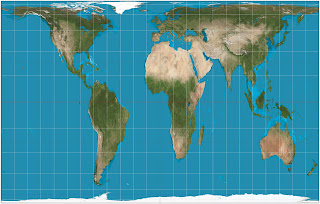
The reason why people usually don't realize how big Africa truly is, is because of the map projections commonly used to show the Earth. Projecting a sphere in 2D is a difficult task and will always have some some compromises. Often the Mercator projection was used.
The Mercator projection distorts the size and shape of large objects, as the scale increases from the Equator to the poles, where it becomes infinite.
Greenland takes as much area on the map as Africa, when in fact Africa's area is approximately 14 times greater than Greenland.
The Gall-Peterson projection is the other extreme. In this projection the landmasses have their actual size compared to each other, but there is a lot of distortion. Here the huge size of Africa is immediately clear.
The Robinson projection is a map projection of a world map, which shows the entire world at once. It was specifically created in an attempt to find a good compromise to the problem of readily showing the whole globe as a flat image.
More about map projections.


No comments:
Post a Comment