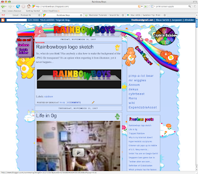
So, what do you think? Has anybody a idea how to make the background of the .PNG file transparant? It's an option when exporting it from illustrator, yet it never happens...

Sketch:

(in reaction to Cybrbeast's comment) Please don't comment the horrible photoshop work... But I don't think it doesn't fit, "contributers" and "previous posts" should be in de same font.
14 comments:
Cool!
I think it is Google that does something with the image that removes the transparency. Google doesn't just put your file online.
Here I did a test without uploading it to blogger. Works fine!
PNG should have alpha channel transparency, so that you can make parts 40% transparent for example. This is very useful if you want it on different colors and have a fading outline. Never used it though.
The big drawback of PNG is that IE doesn't support PNG transparency. Just because PNG is a free format and MS doesn't like it. You thus have to use GIF if you want transparency in IE.
So basically, if you test it on IE, you will never see the PNG transparency because IE and MS SUCKS BALLZZZ!!
the transparency doesn't work that well in your example, the glass plate the letter float above should be transparent (showing the background).
Nice logo, but it doesn't fit in the design of the site if that was what you were intending.
How did that previous icon assignment go btw?
got a 7,5.
Little bit disappointing though, in comparison with my previous assignment which was a 7. thought this one was much much better
How could I ever know that the glass plate should be transparent when I only have your corrupted PNG file without transparency information?
It was a fucking example! Go do the details yourself!
I think someone is having his period right now..:)
Is it you? :)
You don't seem to have the Care Bear font installed on your PC.
I must say the logo looks okay on the frontpage. We need a vote. Add a poll in your post or something.
We need to put a link for the Care Bear font somewhere on the main page btw.
I've put the carebearfont above the contributors
I do have the cearbear font @ home, not at work. It conflicted for some reason with the milions of other fonts I have at work ^.^
This new logo looks amazing!
maybe the font-link should be on the left-side of the page, together with the about-links that aren't working yet.
I like. <3
Post a Comment